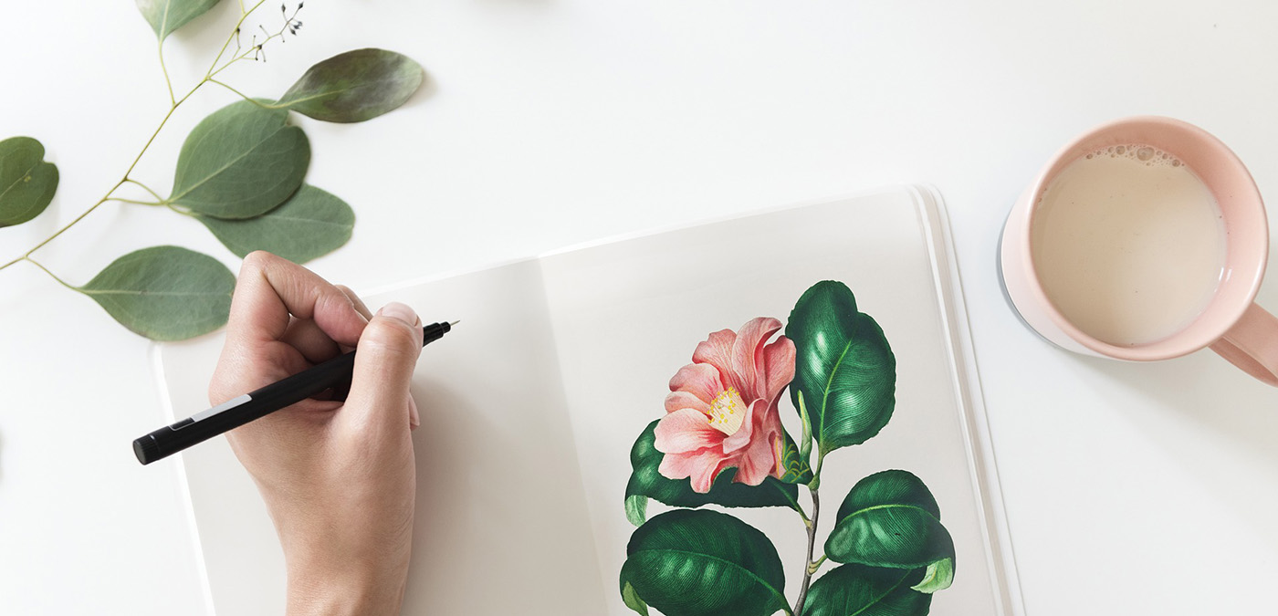
The Art of Mixing Colors – Creating Unique Shades and Hues
Painting is an art form that offers limitless possibilities. One of the most critical aspects of painting is color. With the right mix of colors, you can create an unlimited number of unique shades and hues that can take your painting to the next level.
But how do you mix colors to get the desired result? In this blog post, we’ll explore the art of mixing colors, and give you some tips and techniques to create your own unique shades and hues.
Understanding Primary Colors
The primary colors are red, blue, and yellow. These colors are called “primary” because they cannot be created by mixing other colors together. Instead, they are the foundation of all other colors. By mixing primary colors in various combinations, you can create all other colors.
When you mix two primary colors, you get a secondary color. For example, when you mix blue and yellow, you get green. When you mix red and blue, you get purple. When you mix red and yellow, you get orange.
Primary colors are used in color mixing to create all other colors. Understanding the properties of primary colors is essential for creating a wide range of colors and achieving the desired color in a painting.
Knowing how to mix primary colors and how to achieve specific hues and shades is a fundamental skill for any artist. It allows you to create unique colors that cannot be found in a tube of paint, and it gives you greater control over the final appearance of your painting.
Mixing Secondary Colors
Secondary colors are colors that are created by mixing two primary colors together. There are three primary colors: red, blue, and yellow. When these colors are mixed together in pairs, they create three secondary colors: orange, green, and purple.
Secondary colors are commonly used in color mixing to create a wide range of colors. For example, by mixing equal parts of yellow and green, a yellow-green color can be created. By mixing equal parts of red and purple, a reddish-purple color can be created.
Secondary colors can also be used in color schemes to create a harmonious and balanced effect. For example, an analogous color scheme might use a range of greens, yellows, and oranges to create a calming and cohesive effect. A complimentary color scheme might use a combination of purple and yellow to create a bold and striking contrast.
Overall, secondary colors are an important part of color mixing in painting, providing a wide range of colors and possibilities for artists to explore.
Understanding Complimentary Colors
Complimentary colors are pairs of colors that are opposite each other on the color wheel. The three primary colors (red, blue, and yellow) have complimentary colors that are created by mixing the other two primary colors.
The complimentary colors for each primary color are:
- Red: green (created by mixing blue and yellow)
- Blue: orange (created by mixing red and yellow)
- Yellow: purple (created by mixing red and blue)
Complimentary colors are used in painting to create contrast and visual interest. When placed next to each other, complimentary colors create a strong contrast that can make both colors appear brighter and more vibrant. For example, using a red-orange color next to a blue-green color can make both colors appear more intense.
Complimentary colors can also be mixed together to create neutral tones (gray or brown). Mixing the two complimentary colors in equal parts can produce a grayish color. Adding a little more of one color than the other can produce a brownish color. These neutral tones can be used to create shadows or to tone down the intensity of other colors in a painting.
Overall, complimentary colors are a valuable tool in painting for creating contrast, visual interest, and neutral tones. Understanding how to use them effectively can enhance the overall impact of a painting.
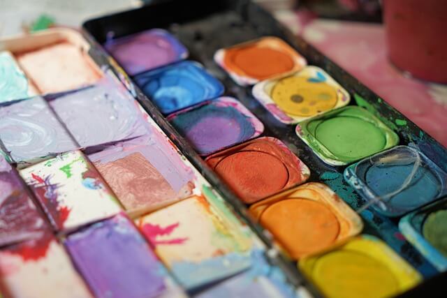
Creating Shades and Tints
Shades and tints are created by mixing a color with black or white, respectively. The difference between shades and tints is the level of darkness or lightness of the color.
Shades are created by adding black to a color. This darkens the color and makes it appear deeper and more intense. For example, if you mix black with red, you get a darker, more muted red color.
Tints are created by adding white to a color. This lightens the color and makes it appear softer and more pastel-like. For example, if you mix white with blue, you get a lighter, more pastel blue color.
The amount of black or white added to the color can vary, allowing for a range of shades and tints to be created. Adding just a small amount of black or white can create a subtle shade or tint, while adding more can create a more dramatic effect.
Shades and tints are commonly used in painting to create depth and variation within a color scheme. By using shades and tints of a particular color, an artist can create a sense of dimensionality and contrast within a painting. For example, using a range of shades and tints of blue can create the illusion of depth and distance in a seascape painting.
Overall, shades and tints are an important tool in a painter’s toolkit, allowing for the creation of a range of nuanced and varied colors. Understanding how to create shades and tints and how to use them effectively can elevate the quality of a painting and add depth and interest to a color scheme.
Using a Color Wheel
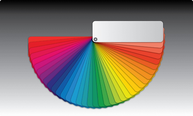
A color wheel is a visual tool that organizes colors in a circular format, based on their relationship to one another. A color wheel can be used in color mixing to help artists understand the relationships between colors and to create harmonious color schemes. Here are some of the benefits of using a color wheel in color mixing:
Understanding color relationships: The color wheel provides a visual representation of how colors relate to each other. The primary colors are evenly spaced around the wheel, with secondary colors located between them. Complimentary colors are located opposite each other on the wheel, while analogous colors (colors located next to each other) create harmonious color schemes.
Creating harmonious color schemes: By using the color wheel to create color schemes, artists can ensure that their colors work together in a cohesive way. Analogous color schemes, for example, use colors that are next to each other on the color wheel and create a harmonious and calming effect. Complimentary color schemes, on the other hand, use colors that are opposite each other on the wheel and create a bold and striking contrast.
Mixing colors accurately: The color wheel can be used to help artists mix colors accurately. By understanding the relationships between colors, artists can mix colors that are harmonious and balanced. For example, if an artist wants to create a muted green color, they can mix blue and yellow (which are adjacent on the color wheel) and add a touch of red (which is the complimentary color to green) to mute the intensity.
Experimenting with new color combinations: The color wheel can also inspire artists to experiment with new color combinations. By using the color wheel as a guide, artists can try out new color schemes and explore the possibilities of color mixing.
Overall, the color wheel is a valuable tool in color mixing, providing a visual representation of color relationships and helping artists create harmonious and balanced color schemes. Understanding how to use a color wheel can improve the quality of a painting and allow artists to explore new possibilities in color mixing.
Experimenting with Different Color Combinations
Experimentation is a crucial part of mixing colors in painting. Every artist has their own unique style, and experimenting with different color combinations is essential for finding the right color palette that works for them. Here are some tips for getting started with experimentation in color mixing:
Start with the basics: Before diving into more complex color mixing, it’s important to start with the basics. Begin by experimenting with mixing primary colors to create secondary colors. For example, mix red and yellow to create orange, or blue and yellow to create green. This will give you a solid foundation to build upon.
Use a limited color palette: Using a limited color palette can be helpful for experimenting with color mixing. By using just a few colors, you can focus on how they interact with each other and create a harmonious color scheme.
Keep track of your mixes: As you experiment with different color combinations, it’s important to keep track of what you’re doing. Write down the colors you’re using and the proportions of each, so you can recreate the mix if you want to use it again.
Use reference materials: It can be helpful to use reference materials when experimenting with color mixing. This could be a color chart or a color wheel, which can help you understand how different colors interact with each other.
Don’t be afraid to make mistakes: Experimentation is all about trying new things and making mistakes. Don’t be afraid to mix colors that you think might not work together – you might be surprised by the results!
Practice, practice, practice: The more you practice mixing colors, the better you will become at it. Experiment with different color combinations and techniques, and don’t be afraid to try new things.
Overall, experimentation is a key part of color mixing in painting. By trying new color combinations and techniques, artists can develop their own unique style and create harmonious and interesting color schemes.
To conclude
In conclusion, mixing colors is an essential aspect of painting. With the right mix of colors, you can create an unlimited number of unique shades and hues.
Understanding primary and secondary colors, complimentary colors, and how to create shades and tints are all essential skills for any painter.
By using a color wheel and experimenting with different color combinations, you can develop your skills and create stunning works of art.